My Favourite Adobe Script Fonts for Luxury, High-End Brands

There is just something about a beautifully chosen script font that instantly changes the feeling of a brand. It can soften a visual identity, add emotion, create elegance, or introduce that subtle sense of timeless luxury that so many modern brands are craving right now.

These are a few of my favourite Adobe Fonts for luxury, fashion, beauty, interiors, hospitality, and considered lifestyle brands, especially for founders wanting a brand that feels elevated, editorial, and quietly magnetic.

Altesse feels dramatic in the most refined way. It has this beautiful balance between softness and confidence, with elongated curves and sweeping movement that instantly feels expensive.

I love it because it feels cinematic and romantic without becoming overly feminine or traditional. The letterforms have movement, which creates emotion instantly. Altesse works best when paired with restraint. I’d avoid using it for large paragraphs or overly busy layouts. Instead, let it breathe.

Parfumerie feels softer, lighter, and more poetic. There Is something very graceful about it that makes brands instantly feel more personal and feminine. I love it because it has an almost handwritten elegance while still feeling polished enough for luxury branding. It doesn’t try too hard.

This font shines when layered into minimal layouts. I love using it for: pull quotes, subtle logo marks and packaging accents.

Snell Roundhand is one of those timeless classics. It feels heritage-led, elegant, and deeply traditional in the best way. It reminds me of old-world luxury, handwritten letters, vintage perfume bottles, European hotels, embossed stationery.

I would use it intentionally and avoid making it feel dated. The key is contrast so pair it with modern minimal layouts, use contemporary photography and combine it with clean sans-serifs. That balance keeps it feeling timeless rather than overly traditional.


Nautica feels incredibly elegant and fashion-forward. It’s refined, minimal, and slightly more modern than traditional calligraphy scripts. I love Nautica because it feels effortless. There’s a simplicity to it that makes even the smallest word feel elevated.

It works beautifully oversized. I love allowing the curves to become part of the visual composition itself. You could try it with; oversized typography and editorial layouts.


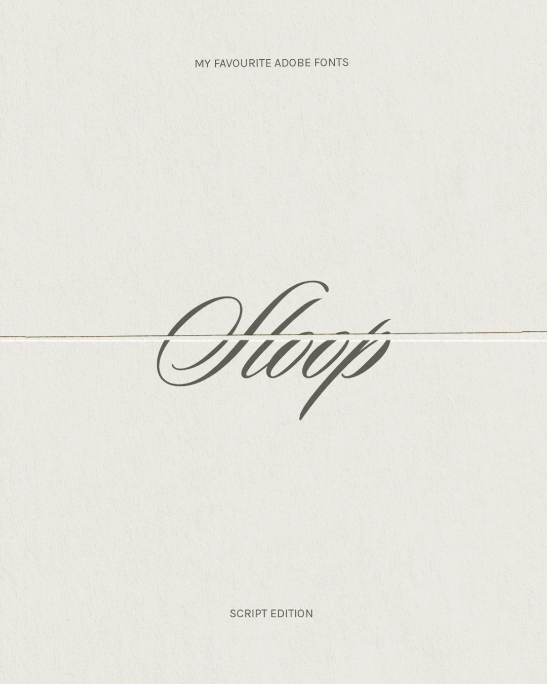
Sloop feels bold, playful, and expressive while still maintaining elegance and I love it because not every luxury brand needs to feel ultra-serious. Sloops introduces personality while still feeling elevated and design-led.

I would say that this font works best as a feature rather than a supporting font. I’d use it for: campaign headlines, launch graphics, statement words and artistic overlays. Pair it with structured typography to create balance.

———

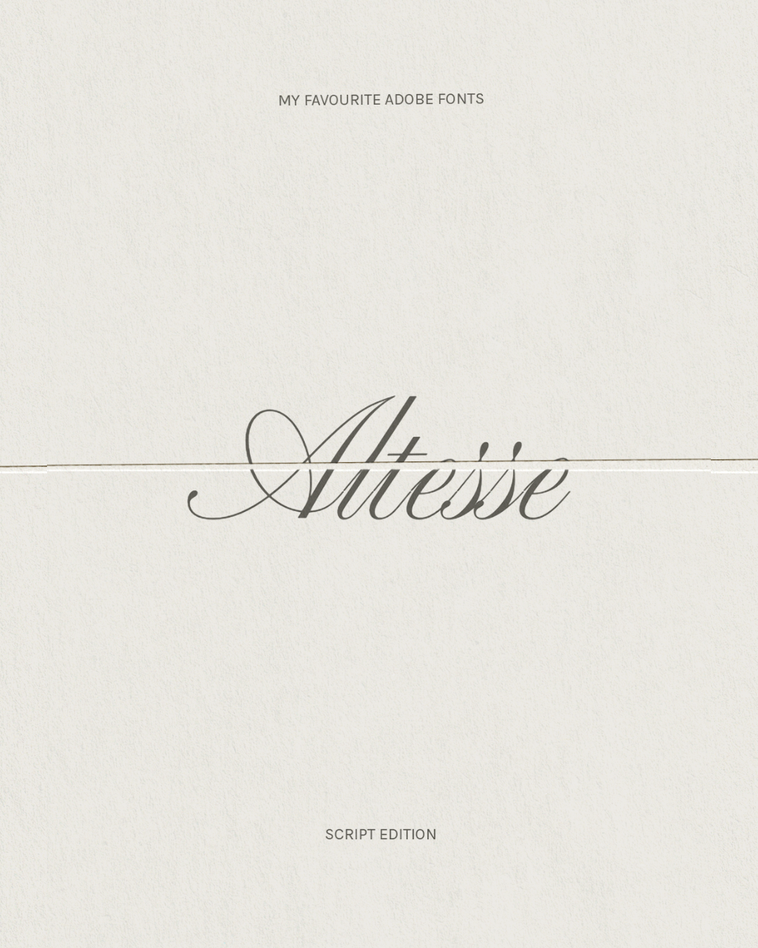
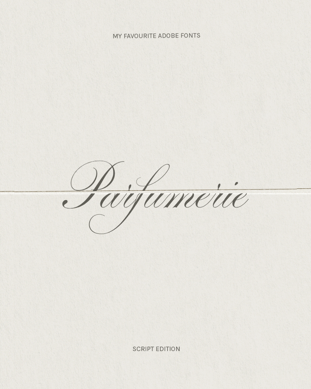
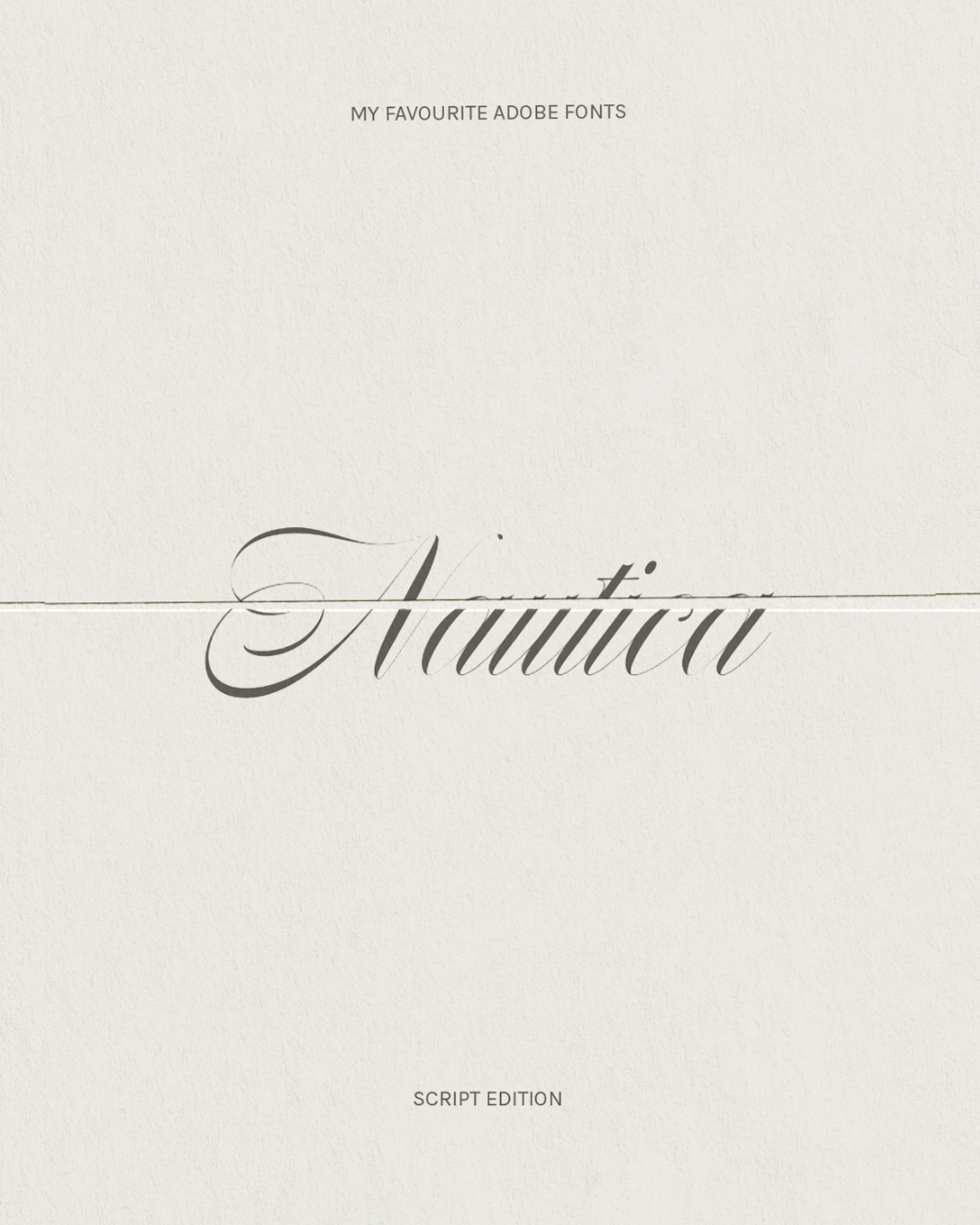
The mistake I see most often with script fonts is overusing them. Luxury branding is usually less about adding more elegance and more about knowing where to place it.

A single script word placed intentionally within a clean visual system often feels far more elevated than an entire identity built around decorative typography and that’s exactly where script fonts become powerful so if you’re building a considered brand, think of script fonts as atmosphere rather than decoration.

Next
Next

How To Choose The Right Branding Agency For Your Small Business